Oklahoma
Best: Tulsa
Interesting. I like it’s simplicity, as well as that pretty clever seal.
Be that as it may, this one actually may be superseded any day now by this rather handsome contest winner:
Somewhat surprisingly, though, Tulsa was not always known for its well-designed flags. Here, for example, is what flew between 1924 and 1941:
Banzai! Maybe the town's penchant for decent flag design all came about as a reaction to that thing.
Worst: Bartlesville
Music! Theatre! Indians! Sports! Oil! Skyscrapers! You can find it all in Bartlesville!
Now, how to improve? Well, this one is easy. B-ville just came up with a snazzy new logo. Throw it one a bed sheet, and you're done:
Oregon
Best: Portland
Here’s a winner. I love the colors, especially the green for the Emerald City (and the area’s forests) and the blue for the Columbia and Willamette rivers. I also like how the intersection of those two rivers is signaled pretty darn cleverly by the cross. Finally, the little offset that creates that little star (representing the city itself) is particularly creative as well. Not too surprisingly, this one is in the NAVA top 10, coming in at #7.
The only beef I have is probably just a quibble from a flag nerd. I just can't help thinking Portland must have been settled by Scandinavians - maybe Swedes in particular.
Douglas Lynch, local graphic designer and president of the local Art Commission can take credit for this one. It dates back only to 2002.
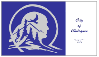
Worst: Chiloquin
The flag as stationery. I also think all that stuff on the left needs is a wolf.
The town? I had to just share this description I found on FOTW:
The City of Chiloquin, Oregon is located approximately 30 miles north of Klamath Falls in Klamath County. It is one mile east of Highway 97. The City limits boast of a population of 720. There is a small airport that parallels the highway. Chiloquin has an altitude of 4178 feet. It is nestled in a small valley surrounded by mountains. The Williamson River runs through the center of town and joins with the Sprague River just to the south of the City limits. Fishing and hunting are favorite sports here. There are deer, elk, and ducks in the area. Agency Lake is a favorite fishing place, while the Williamson River is considered one of Oregon's top trophy fly fishing waters.
With those short, punchy sentences, I'm guessing that might have been written by a 5th grader.
Pennsylvania
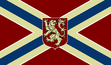
Best: Easton
Unique, and historic too.This one dates all the way back to 1812, and was the flag of a local militia. Some like to claim it goes all the way back to 1776, and was the first national flag.
Bristol is up the Delaware, north of Philly. Dating back to 1752, this burg has not quite 27,000 people. It's the home of Crayola crayons.
Honorable mention: Philadelphia, Pittsburgh
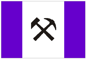
Worst: Coal Township
Well, it kind of gets straight to the point, doesn’t it? That said, that has to be the most inept representation of a coal car I’ve ever seen (I particularly like the googly-eye wheels). Perhaps there’s a classier way to represent mining or coal or what have you. Like maybe this:
Coal Township has just over 10,000 people, is in the center of the state, and features a big prison.
Rhode Island
Best: Little Compton
Straight outta Little Compton (sorry) – simple, large elements, fairly heraldic ... I like it!
Little Compton is on the coast, just east of Newport. It looks like a pretty tony (and historic) place.
Whence the geese and arrow? Honestly, I have no idea.
Honorable mention: Warwick
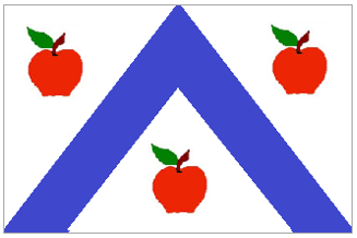
Worst: Cumberland
What is that thing? I mean, the diamond, inside the triangle, inside the shield?
There’s lotta history here. You’d think they could do a little better than this. I mean, it looks like something from a particularly boring PTA.
How to improve? Well, here’s the flag of the county (i.e., shire) of Cumberland, back in merry old England:
What are those things? Well, Grass of Parnassus blossoms, of course.
Hmm. Kinda particular, no? Maybe we could put some stars in there instead:
Oh, the city? It’s in the northeast corner of state. Has about 33,000 people.
South Carolina
Best: Pendleton
This one’s pretty different. Honestly, I wish more flags did that diagonal thing. I also like the blue / red combination. You might think the color contrast wouldn’t work here, but it really does.
At the same time, though, this baby also represents quite an interesting riff on the ol’ red-white-and-blue. Especially with those stars. I really like this one.
Pendelton started as a mountain retreat for Low Country plantation owners. It now counts 3,000 inhabitants. Spent the night there in an old B&B once.
Worst: Florence County
Hooboy, that’s a lotta stuff! How about we get rid of the text, the gears, and some of the many stripes:
Florence County is home to the city of Florence, which also does duty as the county seat. Both county and city were named after the daughter of one Gen. W. W. Harllee.
More links: