So, using the same logic, I would put it to you that a distinguishing feature of a really bad flag is just the opposite … complexity.
#5 Antigua & Barbuda
Triangles, stripes, suns, many colors … What does it all mean? Why is it all there?
Well, here’s what Flags of the World has to say about all that:
The sun represents the dawning of a new era; red - the energy of the people; blue - hope; black, the African ancestry of the people. The combination of yellow, blue and white represent the sun, sand and sea.
I’ll leave it to you to parse it all out.
By the way, this beaut was designed by one Reginald Samuel, a local artist, sculptor, painter and art teacher. He got $500 for it.
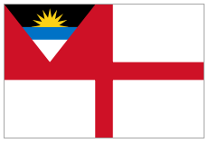
One final thing … It also makes a terrible naval ensign:
#4 Kiribati
Well, at least this one has heraldry on its side. Yup, this is basically Kiribati’s coat of arms. The winner of a competition, the result was actually refashioned by the College of Arms, in London, to be heraldically kosher. Interestingly, the people of Kiribati basically said “up yours,” and stuck with what they had come up with.
I think you can figure this one out. The wavy lines are for the waves of the ocean surrounding the multi-island nation. The sun represents the sun. And that bird is a frigate bird.
The flag actually dates back all the way to 1932, when it was created for the Gilbert and Ellice Islands. Interestingly, it bears a striking resemblance to the flag of the Scotland Company, a Scottish version of the East India Company, from many, many years ago:
All we need is that darn frigate bird.
#3 Zimbabwe
Wow! First of all, it looks like we’ve got 5 separate colors. And four of those make up the stripes. Hey, it’s a quintacolor!
That thing over on the left is a … er ... um … “soapstone bird.” Soapstone bird, you say? Sure. Why not?
We’ve basically got a design by committee here – “submitted by a government independence celebrations committee headed by Mr. Richard Hove, the Minister of Public Works.” Can you tell?
#2 Grenada
Well, at least they’ve managed to keep it to three colors.
That said, it looks like we’ve got a border, green and yellow triangles, some stars, and some weird thingee over on the left. (It’s a nutmeg, by the way. They grow them there.)
This baby was designed by artist Anthony C. George and approved by the Subcommittee of the Grenada Independence Celebrations Committee. Hmm, am I detecting a theme here?
#1 Dominica
6 separate colors! And a parrot! And a bunch of green stars with yellow outlines! And a cross made out of 3 colors! And a kitchen sink! And a partridge in a pear tree! And a n-e-w c-a-r!!!
This baby was designed by a playwright. Sure, why not? They’re famous for their graphic design skills.
More links:


No comments:
Post a Comment