The Americas, on the other hand, represent an odd combination of good flags, bad flags, and flags that I can’t tell whether they’re good or bad.
We’ll start with the good ones …
Organization of Eastern Caribbean States

This is my new favorite flag – clever, distinct, and thoroughly modern.
Indeed, it seems to have been designed by some branding agency, the Present Image Design Limited, a “Total Identity Development and Image Management Company,” based in St. Lucia.
I guess you could think of the OECS as the EU of the Leeward and the Windward Islands. Or the Lesser Antilles. Or … the Eastern Caribbean!
Union of South American Nations

Hey, that’s different. And notice how it looks a little (not a lot, mind you) like the continent itself.
USAN? It’s supposed to be something of an EU for South America. BTW, it’s actually more commonly referred to by its Spanish acronym, UNASUR.
Association of Caribbean States

I like it – even though it looks like it might possibly fly outside a bank. I’m also not totally sure about the symbol. I can make out a C for Caribbean, some waves maybe … but that’s about it.
The ACS is sort of like an EU for the whole Caribbean. Now, I don’t know how that all works with the OECS and UNASUR. And I’m afraid this map is not gonna help me anytime soon either:

Thanks anyway, Wikipedia.
Andean Community of Nations

Okay, so I like the rainbow, and the little steps (which are a typical Incan pattern) and the simplicity … You know, it actually might be a little too simple. Maybe if they had just blown the symbol up a little:

The organization itself, I’m guessing, is some sort of EU for the countries that lie along the Andes?
Hey, I get partial credit for this one at least. The org includes Bolivia, Colombia, Ecuador, and Peru, but leaves out Chile and Argentina. Gee, sorry guys.
Amazonian Parliament

Same thing here. I get the hands, and the trees … And, once again, I like the simplicity – but wonder if it might be a little too simple. Also, I’m thinking this might be a lumber company, or maybe some government’s forestry service, or something.
So, the 8 green triangles are supposed to represent the 8 members of the organization – Bolivia, Brazil, Colombia, Ecuador, Guyana, Peru, Suriname, and Venezuela. Which I get. Together, they’re supposed to represent a tree. Which I am totally not getting.
I honestly have no idea what these guys actually do, as I couldn’t find anything about them in English. Let’s just assume they’re like an EU for the countries of the Amazonian basin. Sure, why not?
Bolivarian Alliance for the Peoples of Our America

I kinda feel like a broken record here … Interesting, cool, clever – but, at the same time, way too subtle. If we could just make those lines just a little bit thicker.
Well, we’ve got another EU wannabe here, but also with a little bit of a twist. Turns out this is a socialist version, having been founded by the late Hugo Chavez. It usually goes by its Spanish acronym, ALBA, which also happens to be Spanish for “dawn.”
Union Latinoamericana

Now, this one is definitely a little different. And I certainly can’t accuse it of soft-pedaling things either. I can, however, accuse it of looking a whole lot like it was designed by Joan Miro. I mean, what are those things?
Flags of the World says the red shapes are supposed to look like Central and South America. The 16 stars on the left represent the 16 countries of Central and South America that speak Spanish. The 2 stars in the upper right represent the 2 non-Spanish speaking countries, Brazil and Haiti. The little spermatozoa in the lower left? FOTW says that it represents a “blue disk with a white shape on it.”
Another mystery organization. I’m guessing it’s not a defunct organization of Hispanic fraternities, as Wikipedia would have me believe.
International Organization of Creole People

Well, the overall design is definitely like that of a real flag. And those certainly are some interesting and unusual colors. In fact, they might be a little too interesting and unusual. I mean, honestly, all I can think of is strawberry and chocolate shakes.
Those two colors are actually supposed to represent different skin colors. In addition, we’ve also got the following, for the stripes:
- Red – native American heritage
- White – European heritage
- Black – African heritage
This org is not a Creole version of the EU. It appears to be mostly a cultural organization, with members from pretty much all over the Caribbean and the world.
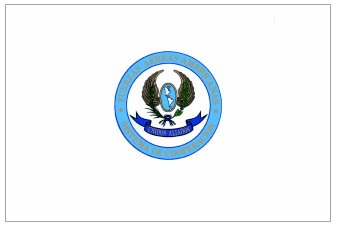
American Police Community

Speaking of interesting colors, this one makes me think of the very old-fashioned cocktail called a grasshopper. Minty green is not, however, the color you would probably want on your flag. We’re also going to have to take off some points for making the center of the flag pretty much indecipherable from more than 10 feet away.
This organization is also known as the Police Community of the Americas, and as AMERIPOL. As you can tell by that last moniker, this is something of a Western Hemisphere version of INTERPOL.
Caribbean Community and Common Market

Yup, we’re surely into the bad ones now. Indeed, this baby appears to be what some high school football team might run out behind right before the kick-off. Go Central Catholic … er, Cook County … um, Columbus Central!
There’s actually some symbolism going on with this one:
- Dark blue – sea
- Light blue – sky
- Yellow – sun
- Green – tropical vegetation (though it doesn’t appear that there’s all that much of that)
Forgive me if you’ve heard this before, but the CC is basically another EU-y sort of thing. It’s commonly known as CARICOM.
Community of Latin American and Caribbean States

Wait, isn’t that a medical condition?
No, it is not. In fact – and according to its website – it’s an “intergovernmental mechanism for dialogue and political agreement.” Love those.
Central American Integration System

Sounds kinda like a software company.
And, boy, is that flag weak. Those are some of the worst color choices I’ve seen in quite awhile. Also, points off for the super boring map, as well as the odd, hypnotic circles.
I would explain this one, but I have a feeling you already know what I’m gonna say here.
Pan American Air Forces Cooperation System
Whoa, what a snoozer. Text that is impossible to read, way too much white, pretty weak colors … And what is that thing in the middle? A flying globe? In the shape of a football?
But at least we have a new theme here. Yup, flying footballs.
Conference of American Armies

Ah, I see someone’s pretty handy with PowerPoint. Probably knocked this out from the time the co-workers were organizing to go out to lunch and the time they actually left.
More military guys. Or, as their website so aptly puts in, “a Military Organization of an international nature.”
More links:
The linking of the C's in the CARICOM flag is also symbolic. It is a basic design but it represents the organization well.
ReplyDelete