Alabama
Best: Mobile

I really like this one. Very distinctive. It’s the basic
pattern of the Israeli flag, something that’s not used that much. Also, the
seal’s not too bad. Luckily, it’s too small to show the rather boring details.
I guess, more than anything, I really just like the 3rd color it
introduces.
Honorable Mention:
Birmingham
Worst: Trussville

Poor Trussville. You’re boring, you’ve got way too much text,
and your colors are bland.
Oh, the actual town? It’s a suburb of Birmingham. Money
Magazine actually has it pegged as one of the nation’s 100 Best Places to Live.
The gateway is nice and seems to be important to the town. Perhaps
it could’ve simply been blown up and the text ditched:

Alaska
Best: Seward

This one's pretty much brand new, dating back to only 2016. The symbolism's pretty obvious - mountains, snow, blue sky - but also very well done. And I love the reflection of the state flag in the star in the upper right corner. The designer was Katelyn Correa, a local schoolgirl who won a contest with over 350 submissions.

Katelyn, with mayor Jean Bardarson
Seward is one of the better-known Alaskan cities. It’s named
after the man who bought Alaska from Russia. In fact, Alaska was once called
Seward’s Folly.
Honorable mention:
Anchorage
Worst: Wasilla

This isn’t a flag. It’s a painting! This should be hanging
over a fireplace somewhere, not flying over city hall.
Did Sarah Palin design this one? Yup, that’s where she’s
from.
Perhaps we could just simplify this one a little. I mean, mountains, sunset, moose, lake, field
… I like them all, but maybe not all at the same time.
Dishonorable mention:
Juneau
Arizona
Best: Scottsdale

Another good example of a decent “SOB.” It’s a little
boring, but is actually pretty classy as well. And you gotta love that cowboy.
It reminds me of the Wyoming license plate.
Oddly, they're coming up with a contest to replace it. The 10 finalists, though. don't look like any kind of improvement. To me, most of them don't look like flags. No sense of history either.
Oddly, they're coming up with a contest to replace it. The 10 finalists, though. don't look like any kind of improvement. To me, most of them don't look like flags. No sense of history either.
Scottsdale is a cool little town, right outside of Phoenix.
I’ve heard it called the Arizona version of Miami Beach. Went to a conference
there once.
Honorable mention:
Phoenix
Worst: Winslow

Whoa! Color contrast! Color contrast! Also, what the heck is that thing?
Now, I do like that baby blue, so maybe we could keep that.
As for the seal, perhaps we could introduce something that references Winslow’s
long transportation history – Route 66, the railroads ... I know! How about the
shield from the Route 66 sign, with the city name at top, and an alternate
version of that figure (it’s supposed to be an Indian mask, by the way):

Boy, I don’t know. I’m just not sure about that mask thing.
Maybe we could just ditch it altogether and go all full Route 66:

Arkansas
Best: Ft. Smith

Not a big fan of the seal. The rest of the flag, though, is
awesome. In fact, I’m surprised there isn’t a country out there who hasn’t
adopted this basic pattern.
Ft. Smith is the 2nd largest city in Arkansas. It’s in the
northwest, right on the border with Texas.
Worst: Bryant
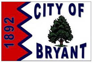
I like the tree and the little jaggy thing (which reminds me
of the flags of Qatar and Bahrain).
Once again, if we just eliminate all that
text, we might just be okay:

By the way, Bryant is a suburb of Little Rock.
California
Best: Los Angeles

You may have heard of this place before. Indeed, the larger
cities tend to have better designs, almost at the country level. The seal, on
the other hand, is pretty forgettable. It’s also small enough, though, that it doesn’t
really matter.
This baby dates back to the 1930s. Not sure where the colors
come from, but I’m guessing the green & red are from Mexico. The serrated
edges are pretty unique.
Worst: Riverbank

Wow! It’s almost all text. In fact, it looks like a button,
something you might pin on your blazer.
Indeed. Riverbank’s Deputy City Clerk comes clean: “In 2002,
a company in Las Vegas, NV specializing in label pins, designed our current
City flag” (Flags of the World).
Perhaps they could have ditched the text & kept the
colors and wave form. The seal’s not gonna help us here any, I’m afraid:

As you can possibly tell from that seal, the town is known
for its wine and cheese festival. It’s got about 20,000 people, is a little
east of Los Angeles, and is about half Latino.
More links:
More links:
No comments:
Post a Comment