Best: Newbury

This looks like one of those classic Revolutionary-era flags. I’m a little surprised this one wasn’t already spoken for.
Newbury is in the northeast part of the Bay State, right along the coast. It dates all the way back to 1635, and has about 7,000 people.
Worst: Colrain

This looks like a school project. An elementary school project. That got a C. Because the teacher was being kind.
Colrain is one of those quaint New England towns. It’s got 1,700 people, and is in the northwest part of the state, near the Vermont border.
Not sure where to go with this one. Heck, the ol’ seal on a bedsheet would be a major improvement here:

I don’t know – it still really needs something else though (a little color, maybe?).
Michigan
Best: Grand Rapids

This looks a little like it belongs in Central America. It sure does beat an old SOB (“seal on a bedsheet”) though.
I’m a little surprised more municipal flags don’t throw some stripes up there with their seals. Seems like an easy way to add a little interest.
By the way, the city also uses a flag based on their logo, which is basically just a glorified map:
Wow! Looks kinda like some sort of vampire Pacman character.
Worst: Mt. Haley

69 characters! It’s a novel.
I also like the clip art. Let’s see, what we’ve got here? – a tractor, a house, the sun, a car, some corn ...
Mt. Haley, a town of less than 2,000, is just west of Saginaw. It looks very flat.
This place is really too small to come up with anything to replace this. I wouldn’t have a clue where to start.
Minnesota
Best: Owatonna

It’s not perfect, but I like the unusual shade of blue, the large coat of arms, and the latter’s somewhat heraldic appropriateness. In fact, this thing even has its own official heraldic description:
- Azure and gules, quartered; parted per pale, argent.
- In dexter chief, three wheat stems, or.
- In sinister chief, interlocking gear wheels, of the third.
- In dexter base, a torch and atomic symbol also of the third.
- In sinister base, a cross, drama mask and music lyre of the fourth.
- In pale, an Indian maiden, proper, affronteé.
- Crest: A cornucopia of the fifth.
- In an escroll under the shield, "Owatonna,"
Owatonna? It’s a decent-sized city of 25,000, almost an hour south of the Twin Cities. The name comes from the Dakota word for “straight,” for the nearby Straight River.
Honorable mention: Minneapolis
Worst: Mora

Busy much?
So, the flag of Mora is like the Swedish flag (a yellow cross on blue), but with a blue-white-red ribbon waving across it (for the Dutch, I assume), a large red Dala horse, and no shortage of text.
Dala horse? Why, the Dala horse is a:
a traditional carved, painted wooden statue of a horse originating in the Swedish province of Dalarna (Dalecarlia). In the old days the Dalecarlian horse was mostly used as a toy for children; in modern times it has become a symbol of Dalarna, as well as of Sweden in general. (Wikipedia)

Not a bad idea. I just wish the rest of the deal wasn’t so darn busy. Maybe we could just throw one of those things on a Swedish blue bedsheet and call it a day (feel free to add the name and the date in yellow).
Mora is a town of 3,000, about an hour north of the Twin Cities.
Mississippi
Best: Natchez

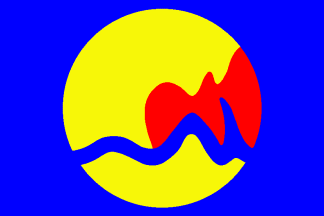
Dear old Natchez. Now, that’s a pretty hip and happening flag for such a traditional, Old South city.
The wavy white line, of course, represents the Mississippi River. Everything else represents all sort of abstract things I’m not sure I have the room for (or interest in).
Honorable mention: Jackson
Worst: McComb

You probably know the city of McComb City as the hometown of Britney Spears (I know I do). It’s in the SW part of the state, almost into Louisiana.
So, what to do with this mess? Well, how about if we take those many components and reduce them down to 2 or 3. For example, here’s the seal on some stripes:

Missouri
Best: Creve Coeur

Creve Coeur is a suburb of St. Louis, means “broken heart” in French, and was supposedly named after some old Indian legend. Somehow or other, they also came up with this very distinct, heraldically perfect flag (which actually reminds me a lot of a pirate ensign as well).
Honorable mention: St. Louis
Worst: Rockaway Beach

Photographic realism is not always your best bet for your flags, ladies and gentlemen. Yeah, this one’s realistic alright. Right down to that copyright.
The red and blue stripes remind me of the Missouri flag, so maybe we could play on that. All we’d really need to do, then, would be to come up with a fish that was a little less detailed. Like so:

Rockaway Beach is a resort town in the Ozarks, right on scenic Lake Taneycomo. It's know mostly for a big motorcycle gang riot back in 1965. Population: 800.
More links:
- > US city flags - Montana thru New Jersey
- < US city flags - Kansas thru Maryland
- International
- Countries
- US states
- Site intro
No comments:
Post a Comment