Friday, May 25, 2018

Regional Flags – Europe (Bad)

Well, as you’ve probably guessed, there is some bad out there with all that good.


International Sava River Basin Commission


Boy, snoozerama, huh? Take a couple of boxes, a little blue stripe, and lots of text; plop it on a bedsheet; and call it a day.

This is one of several river commissions in Europe (all of whom have much better flags, might I say). The Sava? It’s a river (duh) that cuts through the old Yugoslavia and empties into the Danube


Baltic Assembly


Believe it or not, there is such a thing as too much white space. Also, what is that thing?

Why, it’s a … a … er …”blue, stylized, three-contour trefoil” (Flags of the World). What is a “a blue, stylized, three-contour trefoil”? Well, it’s a … “a blue, stylized, three-contour trefoil.” Couldn’t find much of anything else on this one.

The Assembly seems to be just an excuse for Estonia, Latvia, and Lithuania to get together.


European Bank for Reconstruction and Development


What it be? Two O’s? An O and a C?

Sadly, it’s just two links of a chain, symbolizing unity or slavery or something. 

The EBRD? It’s an investment bank that loans out dough to support market economies. It was created in 1991 to support former Eastern Bloc countries, but has since expanded pretty much all over the place.


Assembly of European Regions


22 words! In five different languages! It’s a new European record!

Remember the Adriatic Ionian Euroregion? This is their parent organization. Those languages? French, English, German, Spanish, and Italian.


Liaison Committee of Social Military Organisations


The 1970s called. They want their flag back.

Yeah, this is pretty cheesy. The shadows, that shiny metallic reflection thing, those stars swooping out of the frame, the date …

CLIMS (the LCSMO, in English) is “an international body gathering of military social services whose objective consists in developing bi- or multilateral youth exchanges and family vacations between the Ministries of Defence of the member countries.” What that all means is beyond me. Buncha military types throwin’ a party while on vacation?


Nordic Council


I think these guys may have confused themselves with some airline. Seriously. Eastern? Piedmont? 

So, I guess this group is the blonde-haired, blue-eyed equivalent of the Baltic Assembly (remember them?). 

By the way, that’s a swan. One of those 4-winged Scandinavian swans.

Actually, the wings stand for the four founding members, Denmark, Norway, Sweden, and Finland. There are a couple more these days, but a swan with that many wings would just look weird.


Organization for Democracy and Economic Development (GUAM)


Um, wouldn’t that be ODED? I mean, GUAM’s a little snappier, but I think it’s already taken.

Okay, okay. There are four members in this club – Georgia, Ukraine, Azerbaijan, and Moldova. Ergo, GUAM. But, really, why not MAUG, or GUMA, or MUGA, or AMUG, or UGMA … 


European Stork City Organisation


Okay, it’s an odd flag. But, I mean, really, storks? Stork cities?

Sure enough, ESCO is “an international organisation, joining European towns and cities, which have a stork in their coat of arms.” Honestly? I mean, that’s a thing?

Members include:

  • Busk (Ukraine)
  • Demene (Latvia)
  • Komarovce (Slovakia)
  • Kongaz (Moldova)
  • Luka nad Jihlavou (Czech Republic)
  • Ramygala (Lithuania)
  • Taujenai (Lithuania)
  • Staicele (Latvia)
  • Stolin (Belarus)
  • Storkow (Germany)

So, do they actually get together? What do they do? What do they talk about? Storks?


European Wind Energy Association


Alright, I get it. But, really, isn’t that a little weird? Odd? Creepy? Disturbing?

Actually, EWEA is now Wind Europe. Doesn’t look like they’ve changed their flag though.


Office or Democratic Institutions and Human Rights


Continuing our eye theme ... Holy cow! It’s a tree of eyes! Run for your lives! Tree of eyes! Tree of eyes!

As you can tell from the lower left corner of the flag, ODIHR is an arm of the OSCE. In particular, it is tasked “with the ‘human dimension’ of security.” Whatever that might be.


Yeniche


Also known as the Yenish, the Yeniche people are basically Irish Travelers. Their flag appears to have a fire, a wagon, a basket, and an accordion on it. Sure, why not?


More links:

Friday, May 18, 2018

Regional Flags – Europe (Good)

Hard to believe, but at least one continent had enough good designs that they merited their own post. How could that possibly be? Read on …


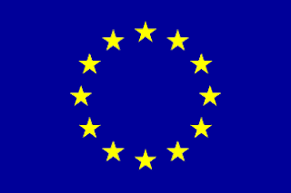
European Union


I think we’re all pretty familiar with this one (and the organization behind it). You gotta admit, though – it truly is a classic.

Ever wondered how it came about though? It was actually designed by an employee, one Arsène Heitz (who did something with railroads). He seemed to have stuffed the ballot box a little, though, having submitted dozens of possible designs.


Slavic Union


I actually like this one because of its echoes of the EU design. Just enough to be different though.

To be quite honest, this is actually a slightly older version. The new one is, unfortunately, very square and, with the addition of a few more flags, rather busy as well.

By the way, I have no idea what this organization is about. Their website is on Tripod (!?!?) and looks like it was done by a 12 year old … back in 1997 … in an afternoon. By the way, do not confuse these folks with a neo-Nazi party of the same name in Russia.


Central European Free Trade Agreement


I can see echoes in this one as well. 

Indeed, CEFTA is a trade agreement of non-EU countries. As such, it’s an org that is constantly losing members, as anyone the EU lets in is gone in a heartbeat. So, whereas CEFTA used to include Poland, Hungary, Czechoslovakia, Bulgaria, Croatia, Czechia, Romania, Slovakia, and Slovenia, it’s now limited to Albania, Bosnia and Herzegovina, Macedonia, Moldova, Montenegro, Serbia, and Kosovo.

As for that rather interesting design? Sorry, couldn’t find a thing on it. Would love to know though. I’m pretty sure it means something.


Paneuropa Union


Continuing our EU theme, this baby was actually in the running for the EU flag, but its cross was objected to by Turkey. I think you can see its influence in the final design though.

The PU (I may be the only one who calls it that) was founded back in 1923, by one Count Richard von Coudenhove-Kalergi. Its members have included notables such as Albert Einstein, Fridtjof Nansen, Thomas Mann, Aristide Briand, Konrad Adenauer, Sigmund Freud, Benedetto Croce, Georges Pompidou, and Winston Churchill. It was, at one time, led by Otto, the Habsburg heir.


Adriatic Ionian Euroregion


So, here’s something a little non-EU for a change. In fact, this one’s a little out there, vexillologically-speaking that is. I mean, those two blues are pretty unusual, not to mention very close in hue (most flags go for a little more color contrast). And that drawing is very modern, and also rather thin and light. The whole thing really works though.

The AIE? Well, their website uses the snappy tagline “THE LARGEST NETWORK OF REGIONAL AND LOCAL AUTHORITIES IN THE MACROREGIONAL AREA” (and, yes, that in all caps). It goes on to say that the organization promotes “trans-national and inter-regional cooperation” among 29 members, most of whom are “NUTS2.” Excuse me? (Oh, that’s “the first level below State, in conformity with the European Community nomenclature NUTS, and with the administrative organization of each country.")


European Southern Observatory


Just to show that Europeans can even make what is basically an acronym look good. 

The ESO is basically a partnership between Europe and Chile so that European astronomer types can gaze at the stars from the crystal clear Chilean desert.


Organisation for Security and Co-operation in Europe


Flags that do a good job with dopey, old acronyms are just so rare that I had to include another one.

The OSCE is pretty big time. With 56 members in Europe and actually all over the globe, it’s the biggest regional security org there is. It’s into the usual do-gooder stuff – arms control, promotion of human rights, freedom of the press, fair elections, conflict prevention, crisis management, post-conflict rehabilitation …


Friday, May 11, 2018

Regional Flags - the Americas

We expect bad stuff. We also appreciate it when there’s some good stuff as well.

The Americas, on the other hand, represent an odd combination of good flags, bad flags, and flags that I can’t tell whether they’re good or bad.

We’ll start with the good ones …


Organization of Eastern Caribbean States


This is my new favorite flag – clever, distinct, and thoroughly modern.

Indeed, it seems to have been designed by some branding agency, the Present Image Design Limited, a “Total Identity Development and Image Management Company,” based in St. Lucia.

I guess you could think of the OECS as the EU of the Leeward and the Windward Islands. Or the Lesser Antilles. Or …  the Eastern Caribbean!


Union of South American Nations


Hey, that’s different. And notice how it looks a little (not a lot, mind you) like the continent itself.

USAN? It’s supposed to be something of an EU for South America. BTW, it’s actually more commonly referred to by its Spanish acronym, UNASUR.


Association of Caribbean States


I like it – even though it looks like it might possibly fly outside a bank. I’m also not totally sure about the symbol. I can make out a C for Caribbean, some waves maybe … but that’s about it.

The ACS is sort of like an EU for the whole Caribbean. Now, I don’t know how that all works with the OECS and UNASUR. And I’m afraid this map is not gonna help me anytime soon either:


Thanks anyway, Wikipedia.


Andean Community of Nations


Okay, so I like the rainbow, and the little steps (which are a typical Incan pattern) and the simplicity … You know, it actually might be a little too simple. Maybe if they had just blown the symbol up a little:


The organization itself, I’m guessing, is some sort of EU for the countries that lie along the Andes? 

Hey, I get partial credit for this one at least. The org includes Bolivia, Colombia, Ecuador, and Peru, but leaves out Chile and Argentina. Gee, sorry guys.


Amazonian Parliament


Same thing here. I get the hands, and the trees … And, once again, I like the simplicity – but wonder if it might be a little too simple. Also, I’m thinking this might be a lumber company, or maybe some government’s forestry service, or something.

So, the 8 green triangles are supposed to represent the 8 members of the organization – Bolivia, Brazil, Colombia, Ecuador, Guyana, Peru, Suriname, and Venezuela. Which I get. Together, they’re supposed to represent a tree. Which I am totally not getting.

I honestly have no idea what these guys actually do, as I couldn’t find anything about them in English. Let’s just assume they’re like an EU for the countries of the Amazonian basin. Sure, why not?


Bolivarian Alliance for the Peoples of Our America


I kinda feel like a broken record here … Interesting, cool, clever – but, at the same time, way too subtle. If we could just make those lines just a little bit thicker.

Well, we’ve got another EU wannabe here, but also with a little bit of a twist. Turns out this is a socialist version, having been founded by the late Hugo Chavez. It usually goes by its Spanish acronym, ALBA, which also happens to be Spanish for “dawn.” 


Union Latinoamericana


Now, this one is definitely a little different. And I certainly can’t accuse it of soft-pedaling things either. I can, however, accuse it of looking a whole lot like it was designed by Joan Miro. I mean, what are those things?

Flags of the World says the red shapes are supposed to look like Central and South America. The 16 stars on the left represent the 16 countries of Central and South America that speak Spanish. The 2 stars in the upper right represent the 2 non-Spanish speaking countries, Brazil and Haiti. The little spermatozoa in the lower left? FOTW says that it represents a “blue disk with a white shape on it.”

Another mystery organization. I’m guessing it’s not a defunct organization of Hispanic fraternities, as Wikipedia would have me believe. 


International Organization of Creole People


Well, the overall design is definitely like that of a real flag. And those certainly are some interesting and unusual colors. In fact, they might be a little too interesting and unusual. I mean, honestly, all I can think of is strawberry and chocolate shakes.

Those two colors are actually supposed to represent different skin colors. In addition, we’ve also got the following, for the stripes:

  • Red – native American heritage
  • White – European heritage
  • Black – African heritage

This org is not a Creole version of the EU. It appears to be mostly a cultural organization, with members from pretty much all over the Caribbean and the world.


American Police Community


Speaking of interesting colors, this one makes me think of the very old-fashioned cocktail called a grasshopper. Minty green is not, however, the color you would probably want on your flag. We’re also going to have to take off some points for making the center of the flag pretty much indecipherable from more than 10 feet away.

This organization is also known as the Police Community of the Americas, and as AMERIPOL. As you can tell by that last moniker, this is something of a Western Hemisphere version of INTERPOL.


Caribbean Community and Common Market


Yup, we’re surely into the bad ones now. Indeed, this baby appears to be what some high school football team might run out behind right before the kick-off.  Go Central Catholic … er, Cook County … um, Columbus Central!

There’s actually some symbolism going on with this one:

  • Dark blue – sea
  • Light blue – sky
  • Yellow – sun
  • Green – tropical vegetation (though it doesn’t appear that there’s all that much of that)

Forgive me if you’ve heard this before, but the CC is basically another EU-y sort of thing. It’s commonly known as CARICOM.


Community of Latin American and Caribbean States


Wait, isn’t that a medical condition?

No, it is not. In fact – and according to its website – it’s an “intergovernmental mechanism for dialogue and political agreement.” Love those.


Central American Integration System


Sounds kinda like a software company. 

And, boy, is that flag weak. Those are some of the worst color choices I’ve seen in quite awhile. Also, points off for the super boring map, as well as the odd, hypnotic circles.

I would explain this one, but I have a feeling you already know what I’m gonna say here.


Pan American Air Forces Cooperation System


Whoa, what a snoozer. Text that is impossible to read, way too much white, pretty weak colors … And what is that thing in the middle? A flying globe? In the shape of a football?

But at least we have a new theme here. Yup, flying footballs. 


Conference of American Armies


Ah, I see someone’s pretty handy with PowerPoint. Probably knocked this out from the time the co-workers were organizing to go out to lunch and the time they actually left.

More military guys. Or, as their website so aptly puts in, “a Military Organization of an international nature.”


More links:

Saturday, May 5, 2018

International Flags


These things may be the most boring flags of all. Nine times out of 10, they’re white, with lots of text and maybe some totally meaningless symbol.


Minimalist

As Gertrude Stein once said of Oakland, CA, with these flags, there’s no there there. 

Honestly, these things are so bland and meh that they barely register.


Eurasian Economic Union


That’s it? It looks like two different-colored smudges.

The EEU? Apart from sharing an acronym with the European Economic Union, this EEU looks like a weak attempt to recreate the Commonwealth of Independent States. In particular, it includes Russia, Belarus, Armenia, Kyrgyzstan, and Kazakhstan. Tellingly, it was first proposed by primo Kazakh nut job and president Nursultan Nazarbayev.

Supposedly, someone won $1,250 for coming up with this baby.


Intra-Parliamentary Union


A wreath, a temple, and a date. Wow, talk about being coy.

Now, this might be okay if this was an organization that anyone had ever heard out before. Never heard of the IPU? Here, I’ll let them toot their own horn:

We are a unique organization made up of national parliaments from around the world.  We protect and build global democracy through political dialogue and concrete action.

We are a vibrant and growing group. We currently have 178 Member Parliaments and 12 Associate Members. We work closely with the United Nations and other partner organizations whose goals we share. Today, we are the organization that most closely reflects world public opinion.

Actually, this group may be legit. It was the first “permanent international political organization and provided the origins for multilateral cooperation between nations today,” and predates the League of Nation and the UN. Its 2 founders would both win the Nobel Prize.


Color Contrast

Ergo, lack of it being a bad thing. I devoted a wholepost to country flags with this particular diagnosis. International flags, though, seem to make a specialty of it.


International Energy Agency


This is so light I can’t imagine anyone could even read it from 10 yards away.

The IEA is a very tony 1st world kind of club. It was developed in response to the Oil Crisis of the ‘70s, and seems to be involved in all sorts of energy-related stuff.


World Canals Conference


And here we have the other end of the spectrum. Not only is this super busy, but white text on an extremely light blue background makes parts of this flag completely invisible.

The WCC is an event sponsored by Inland Waterways International, and brings together “hundreds of canal enthusiasts, professionals and scholars from around the world, to exchange good practices on canals, including the protection of historic canals or features, revitalization of canal systems, harbour sites, canal trails and amenities.” As someone who has biked the C&O and plan to bike the Lehigh Canal, I salute these folks.


Busy, busy, busy


International Space Station


Continuing our busy theme ... This looks more like a refrigerator magnet.

I think we’re all familiar with the ISS. I think it’s still out there.


Corporate Letterhead

Now we’re talkin’. This is what I associate with international flags. Boring white backgrounds, lots of text … Heck, these aren’t flags. Stationery maybe. Definitely not flags though.


International Finance Corporation


Word count: 7. Colors: 2.

The IFC? Whoa, I think you’ve heard of these boys. No, not the cable channel. The Intrafraternity Conference? Not exactly. Arm of evil organization that rules the world? Yup, that’s the one.


Iter


Word count: 8. Colors: 2.

Iter? Iter?!?! What the hell is an “iter”?

Unbelievably, it’s not an acronym. In fact, it’s Latin, for “the way.”

Equally unbelievably, this is not a cult. Instead, it’s “one of the most ambitious energy projects in the world today. In southern France, 35 nations are collaborating to build the world's largest tokamak.”

So, what the hell is a “tokamak”? Well, according to their website, it’s a “a toroidal apparatus for producing controlled fusion reactions in hot plasma.” But of course.


World Economic Forum


Word count: 11. Colors: 2.

And all in upper case.

Ohmigod, these are the Davos people. These really are the people who rule the world.

So, honestly, I have to ask … Is there a correlation between the boringness of your flag and the degree to which you dominate the world? If so, I’d like to propose the following:


What is it? 

That “totally meaningless symbol” I mentioned at the beginning of this post? That would be these.


So, I’m seeing a G? And a 7?  And another 7?

Sure enough, this is the flag of the G77 Information Trade Network. Who? What? Well, typing that into Google (at least that G77 bit), gets me the following:
  • G77 pill (a narcotic)
  • G77 command not found (a computer error)
  • G77 countries

And that last one leads me to the actual organization itself. And all that is is a group of developing nations. It’s usually known as the Group of 77. Though it actually started with that number of members, they’ve pretty much doubled since then.


So, I see an O, and an I … and 2 other I’s … and …

Hey, it must be the OIII – you know, the O triple I? The Organization of International something something?

Actually, it’s the Organization of World Heritage Cities.

The OWHC is “an international non-profit, non-governmental organization of 250 cities in which sites of the UNESCO World Heritage list are located.”

I haven’t a clue what the flag is supposed to represent.


Weird

This next set doesn’t have anything in particular in common except for just plain weirdness.


United Nations International Research and Training Institute for the Advancement of Women


Ah, yes, the UNIRTIAW. Catchy that.

INSTRAW though? Honestly, I have no idea how they got that.  Au francais?

According to Wikipedia, these folks have:

been the leading United Nations body of the research, knowledge management and capacity development of gender equality and women's empowerment. The Institute's participatory and innovative approaches to research have produced gender disaggregated data and research results that have served to better inform the design of training and capacity-building programmes and to strengthen stakeholder capacity to address and effectively integrate gender perspectives in all policies, programmes and projects. UN-INSTRAW works in partnership with governments, the United Nations System, civil society and academia.

Catchy, no?


International Railwaymen’s Sport Union


Is he train surfing? Isn’t that dangerous?

The organization? Their website very helpfully tells us that the USIC (they take their acronym from the French version of the name) is “an international railways sporting association with members from various countries.”


Red Crescent Society


This flag is for the Iranian version of Red Cross.  That’s supposed to be a lion.


World Anti-Doping Agency


Cucumbers?  Green seeds?

Oddly, the second guess is correct. Why green seeds? Haven’t a clue.

I think we’re all familiar with the WADA, especially with the Winter Olympics coming up.


Good

It seems only fair that I put in one here that I actually like.


St John Ambulance


Unfortunately, though, this group sounds more like a rock band from the late 60s. In actuality, they’re an organization that promotes first aid training and the provision of ambulance and other services in local communities.


More links: