Saturday, January 27, 2018

Bad Country Flags – Just Plain Weird

Most flags are happy with nice simple shapes like stripes, and stars, and moons, and crosses. Oh sure, there are some coats of arms, some eagles, a couple of discs … And then Canada’s got their maple leaf and Israel their star of David.

But what the heck is this stuff?


#5  Tajikistan


What is that thing?  A bottle opener?

Supposedly, this is a “stylized crown.” Sorry, but I’m just not seeing it. 

Here, though, is an explanation (from someone on FOTW):

The word 'tojik', which is the root of the countries name 'Tojikiston' comes from the Persian word 'toj' meaning a 'crown'. Tojik, therefore, means the person that wears a crown. From what I have heard, the Tojik nation comes from a group of a very well-known warriors (at that time) that wore crowns. Hence, they were called 'Tojikon' (Tajiks in English).

If you’re like me and can’t keep your Stans straight, Tajikistan is the little one, up in the mountains just north of Afghanistan.


#4  Kyrgyzstan


Bocci balls look like this, don’t they? So, I guess this is a flaming bocci ball, no?

Would you believe it’s a yurt? I don’t know, I guess from above maybe. Or perhaps from inside. Not totally sure why it’s on fire.  Honestly, I was pretty sure it was going to be some kind of sun. Go figure.

Kyrgystan? It’s the next biggest one, and is itself right on top of Tajikistan. Mountainous as well, it actually has fewer people than its southern neighbor – 5.7M to 8.7M.


#3  Mongolia


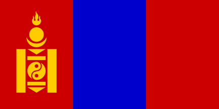
Except for that flaming thing at the top, all that business over on the left looks more like something some 2-year-old put together with a set of blocks.

Would you believe that thing has a name? Yup, it’s a “soyombo,” and represents the following:


Its origins are closely associated with Lamaism, and the various elements of the design were regarded as having mystical meanings. Individually, parts of the design also may be related to brands of ownership placed on horses and cattle. The fire symbol has multiple significance. It represents revival and growth, and also the family hearth and the continuity of the people. The fire has three tongues of flame, symbolizing past, present, and future. Below the fire are symbols of the sun and moon, links to the pre-Buddhist nature religion of the Mongols. In ancient Mongolian symbolism, an arrow or spear pointing to the ground meant death. In the soyombo, two downward-pointing triangles signify death to the enemies of the Mongols. Two horizontal rectangles represent honesty and fairness between rulers and the people. Set between the two horizontal rectangles is the Chinese sign of yin and yang, representing dark and light, female and male, cold and hot – the unity of all opposites in the cosmos. In Mongolian symblism, the figures in the yin-yang circle represent two fish which, because fish never close their eyes, signify reason and wisdom. The two vertical rectangles represent a fortress, recalling the old Mongolian proverb "The friendship of two men is stronger than stone walls." The symbol of the fortress signifies that the unity of the Mongol people is the foundation of the nation's strength. (Flags of the World)

Whew! I’m exhausted.


#2  Northern Mariana Islands


Did they win a contest for best island or something? Also, what is that wreath made of:
  • Popcorn
  • Deviled eggs
  • ???

So, that trophy? It’s actually a “latte stone.” No, that has nothing to do with Starbucks. Instead, it’s “a pillar capped by a hemispherical stone capital (tasa) with the flat side facing up. Used as building supports by the ancient Chamorro people, they are found throughout most of the Mariana Islands” (Wikipedia).

The popcorn / deviled  eggs / whatever? Why, it’s a mwarmwa. But of course! What’s a mwarmwa? Other than its being a “decorative wreath,” I’m afraid I couldn’t find that much.

The Northern Mariana Islands? Just a bunch of atolls in the Western Pacific, basically a territory of the US.


#1  Isle of Man


Hard to believe, but this thing has a name too. It’s called a “triskelion.” It’s from an ancient pattern that usually emphasizes the swirly pattern, and less so the human limbs:


Interestingly, there’s actually a flag out there that’s identical to the Isle of Man’s, but with a face in the middle – it’s a traditional flag for the island of Sicily: 


More links:

Friday, January 19, 2018

Bad Country Flags – Uh, What Is It?

You’ve got two choices when it comes to flag design. You can go abstract or you go representative. 

On the abstract side, you’ve got most of the world’s flags. Take, for example, all those tricolors out there. You know, the three stripes of different colors, vertical or horizontal, first adopted by France and then repeated dozens, if not hundreds, of times elsewhere (Italy, Belgium, Mexico, Chad ….).

Representative flags actually show something. You’ve got the maple leaf on Canada’s flag, the rising sun on Japan’s, the sun on Uruguay’s, the crescent moon and star on Turkey’s …

These babies? I’m not totally sure what they are.


#7  Vanuatu


Why, it’s a pig’s tusk and some “crossed leaves of the namele fern,” of course. Now, the latter represents peace, while the former represents wealth and prosperity. Here, I’ll let Flags of the World explain that last bit:

The boar's tusk is a symbol of prosperity because (1) pigs are wealth (2) in the latter stages of getting the tusk to grow in a spiral the pig has to be hand fed, and you need status and wealth to have both the pig feeder and the food which are necessary.

Obvious. (And remember, pigs are wealth.)

Another contest winner, with the designer being one Kalontas Mahlon, who works at Vila Handprints. Once again, that’s from FOTW – so you know it’s actually true. No fake news there.


#6  Antarctica


Bet you didn’t know Antarctica even had a flag.

Now, if you’re a real geography buff like me, you probably already know what’s in the middle of this one. That little blob with a tail? That’s actually Antarctica itself.

But what does Antarctica seem to be caught in? A radar screen? A spider web? Turns out those are the lines of longitude and latitude. In other words, this is basically just a little map.

What it reminds me of, though, is the flag of SPECTRE, or Smersh, or some other evil entity out to control the world. Hmm, maybe that’s what those guys are getting up to way down there with all those penguins.


#5  St Lucia


Isn’t this the corporate logo of Weyerhaeuser, or Georgia Pacific, or Caterpillar, or somebody?

So, what is it actually? According to FOTW, it represents the Pitons, “which are recognized by the people of St. Lucia and by the world as the symbol of this island.” Sure. There’s also some stuff about the yellow representing sunshine, and the black and white representing the “twin cultures” of this rather posh place.

This baby was designed by local artist Dunstan St. Omer. The original flag, which had a darker blue and a much less skinny symbol, actually looked a lot better… but still very much like it should be flying over some factory or corporate headquarters.


#4  St Vincent & The Grenadines


There’s gotta be a rock band out there with this name, right? Well, at least we got the St.Vincent part right, no?

Believe or not, that thing in the middle represents the letter V, for Vincent. I always assumed that there might be, say, 3 islands, or at least 3 main ones. No such luck. The diamonds themselves represent the idea that the country is considered the “gem of the Antilles.” Sure, right.

There are also a couple of things a little off about this flag. Did you notice, for example, how the V is definitely a little below center? That’s to represent the nation’s “location in the Antilles.” Instead, it looks more like they didn’t quite nail it, centering-wise. Did you also notice how the yellow stripe is bigger than the others? That’s to represent, oh, heck, I don’t know … Just make something up, okay?


#3  Tokelau


So, what is that thing? Front part of a snowmobile? Hand-vac?

Turns out it’s a boat. In fact, it’s a “stylized Polynesian canoe.” But of course.

Tokelau? It’s just a handful of islands in the Pacific, basically run by New Zealand.

And that what’s behind the stars. Yup, it’s the old Southern Cross, featured on the flags of New Zealand, Australia, and a whole bunch of others.


#2  Christmas Island


Hey, it’s the Southern Cross! And that thing over on the right? I think that might be a bird. In the middle? Man, I don’t know. Is it a slug? A snail outside its shell? A poodle missing its hind legs?

Actually, it’s Christmas Island! Christmas Island??? That’s an island off of the island of Bali and officially part of Australia. 

This baby was the result of a contest, won by one Tony Couch, of Sydney. He won $100 Australian for his efforts. I think he should give it back.


#1  St Eustacius


I swear this is the alligator character from Pearls Before Swine. Am I right?

Am I right?

St. Eustacius? It’s an island in the Caribbean, and is owned by the Netherlands.


More links:

Saturday, January 13, 2018

Bad Country Flags – Busy, Busy, Busy

What makes a really good flag? Simplicity. Think of the French tricolour. Three stripes – red, white, and blue. Think of Japan’s flag. A red disc in a white field. How about Denmark’s white cross, on a red field?

So, using the same logic, I would put it to you that a distinguishing feature of a really bad flag is just the opposite … complexity.


#5  Antigua & Barbuda


Triangles, stripes, suns, many colors … What does it all mean? Why is it all there?

Well, here’s what Flags of the World has to say about all that:


The sun represents the dawning of a new era; red - the energy of the people; blue - hope; black, the African ancestry of the people. The combination of yellow, blue and white represent the sun, sand and sea.

I’ll leave it to you to parse it all out.

By the way, this beaut was designed by one Reginald Samuel, a local artist, sculptor, painter and art teacher. He got $500 for it. 

One final thing … It also makes a terrible naval ensign:


#4  Kiribati


Well, at least this one has heraldry on its side. Yup, this is basically Kiribati’s coat of arms. The winner of a competition, the result was actually refashioned by the College of Arms, in London, to be heraldically kosher. Interestingly, the people of Kiribati basically said “up yours,” and stuck with what they had come up with.

I think you can figure this one out. The wavy lines are for the waves of the ocean surrounding the multi-island nation. The sun represents the sun. And that bird is a frigate bird. 

The flag actually dates back all the way to 1932, when it was created for the Gilbert and Ellice Islands. Interestingly, it bears a striking resemblance to the flag of the Scotland Company, a Scottish version of the East India Company, from many, many years ago:


All we need is that darn frigate bird.


#3  Zimbabwe


Wow! First of all, it looks like we’ve got 5 separate colors. And four of those make up the stripes. Hey, it’s a quintacolor!

That thing over on the left is a … er ... um … “soapstone bird.” Soapstone bird, you say? Sure. Why not?

We’ve basically got a design by committee here – “submitted by a government independence celebrations committee headed by Mr. Richard Hove, the Minister of Public Works.” Can you tell?


#2  Grenada


Well, at least they’ve managed to keep it to three colors.

That said, it looks like we’ve got a border, green and yellow triangles, some stars, and some weird thingee over on the left. (It’s a nutmeg, by the way. They grow them there.)

This baby was designed by artist Anthony C. George and approved by the Subcommittee of the Grenada Independence Celebrations Committee. Hmm, am I detecting a theme here?


#1  Dominica


6 separate colors! And a parrot! And a bunch of green stars with yellow outlines! And a cross made out of 3 colors! And a kitchen sink! And a partridge in a pear tree! And a n-e-w c-a-r!!!

This baby was designed by a playwright. Sure, why not? They’re famous for their graphic design skills.


More links:

Saturday, January 6, 2018

Bad Country Flags – (Lack of) Color Contrast

Ever been to a website where the text is, oh, blue on grey, or green on red, or orange on yellow? Hard to read, right? Know why? Lack of color contrast. The two hues are just too darn similar to easily separate them apart.

Something similar happens with flags. No, it’s not a matter of lack of legibility. It’s usually just a matter of putting two colors together that simply don’t go together. Red and green, for example. Or red and blue. Heck, how about blue and black?

Interestingly, heraldry – from which many flags can trace their origin – does not allow such things to happen. They have rules that state that darker colors – red, blue, green, black – have to border on lighter ones – white and yellow, mainly.

These guys? Heck, they don’t need no stinkin’ rules.


#6  Russia


This may very well be where it all started. The Russian flag was famously created as a simple re-jiggering of the flag of the Netherlands (red, white, and blue). Turns out Peter the Great visited there early in his reign and much admired what he saw, including their flag. Unfortunately, he also violated some basic rules of heraldry when he switched the colors around a little and came up with this baby.

I will spare you all the others – Slovenia, Slovakia, etc. – that closely mimic this.


#5  Armenia


I’m not sure if the Russian flag influenced this one or not. It was originally adopted back in the 1920s, when Armenia was briefly independent. There was also, however, a very similar flag dating all the way back to the 14th Century.

The orange on this flag is officially known as “apricot.” Somehow or other, it represents “courage.” 


#4  Estonia


We’re still in the general area of the old Soviet Union, so I’m guessing there’s probably an influence here as well. Estonia’s flag dates all the way back to 1881. It’s called the sinimustvalge, which is Estonian for “blue-black-white,” but sounds a lot like the “cinnamon flag” to me.

Here’s a fascinating photo that shows a winter landscape in Estonia, and also offers an alternative explanation for where the flag comes from (credit: Valmar Valdmann):


#3  Libya


This one’s a multiple offender – black on red and black on green. And they do not have Russia to blame here either.

Libya’s flag dates back to 1951, when Libya gained its independence (from Italy, of all places). The colors are directly from the three states – Tripoli, Cyrenaica, and Fezzan – that made up the modern country. And those flags were basically just the solid colors –green, black, and red, respectively – with some moons and stars sprinkled on them. 

This flag was superseded in 1969 by two horrors owing much to Col. Qaddafi. The first was the same as Egypt’s (a red, white, and black horizontal tricolor). The second was just a solid block of green. The original flag was restored in 2011 when Qaddafi was ousted.

Wanna see what that flag might look like with some fimbriations (a white line to separate the colors)?


Not bad, if I must say so myself. Might work for Armenia as well.


#2  Bangladesh


Now, there are actually certain color combinations that are, not just hard to read or aesthetically objectionable, but that actually do weird things with your eyes. Red and green are the classic example, setting off seeming vibrations. Tell me this doesn’t happen to you on this one.

The red on the Bangladeshi flag supposedly represents the “blood of the martyrs of independence,” or some such tired patriotic theme. Correspondingly, the “bottle green” of the background represents the “lushness of the country.” For me, the two have always said “hot sun” and “Islam.”

Interestingly, the Bangladeshi flag is the only one other than Japan’s and Palau’s (yellow disc on light blue background) that uses this basic format. 


#1  Morocco


So, if that last one didn’t vibrate for you, this one surely will.

Up to 1915, the Moroccans used a plain red flag. They then added this star, known as the seal of Solomon (and symbolizing the Five Pillars of Islam). Interestingly, that symbol is also known officially as a “pentagram” (which, admit it, definitely sounds a little satanic).

Morocco has had some very interesting flags in the past. In the 11th through 13th Centuries, Moroccan flags prominently featured a checker board. In the 17th through 19th Centuries, it was a pair of scissors.


More links:

Monday, January 1, 2018

Bad Country Flags – Why Even Bother?

Wow! Talk about phoning it in. 

Who designed these things? How long did it take them? Who exactly are we trying to kid here?


#5  Guam


I always love it when the flag designer feels a need to spell out the name. It’s a fairly popular motif for US states, but you tend not to see it elsewhere. 

That said, Guam is an American territory. And this thing was designed (in 1917) by the wife of an American naval officer. 

Would you believe, though, that it was actually even more boring at one time? Yup, turns out the red border was a later addition.

Now, though that little scene might seem as generic as could be, there’s actually quite a bit of heavy symbolism going on here:


The background of the flag is a striking deep blue, which represents the ocean, accented by a red border. In the center of the flag is an oval figure in the shape of a slingstone used by the ancient Chamoru. The flying proa, a swift, seagoing canoe, typifies the courage of the first inhabitiants who travelled intrepidly across the Pacific Ocean. The coconut tree growing in barren sand depicts the determination of the earliest settlers to overcome whatever natural causes confronted them.

By the way, the red of the border? It’s our old favorite – the blood of somebody or other who died for their land.


#4  Cyprus


Actually, there happens to be a good reason why this one is so darned bland. Turns out Cyprus really doesn’t have much cred as its own country, but is basically just divided between Turks in the north and Greeks in the South. The flag, which was created in 1960, tried to paper over that fact, coming up with something bland enough to not favor or insult either group.

And what does that leave us with? How about a very basic white background, a map of the country, and some olive branches (for peace between the two sides, of course). By the way, that rather odd color used for the country is “copper” – to represent a very important early import and also the source of the country’s name.

By the by, the country is now officially divided between the two ethnic groups. Though the Greeks have held on to the old flag, the Turks now have their own:


#3  Kosovo


Not too oddly, there’s a similar story behind this one as well. Turns out Kosovo is made up of Albanians and Serbs, who tend to fly the flags of … Albania and Serbia.

This baby was actually approved by the Kosovo Unity Team, a group organized by the UN. Can you tell?

That thing in the middle? Though it does look like an outline of the food on my plate at a Thanksgiving dinner, you probably already guessed that it’s is the country itself. 


#2  Micronesia


Ditto. This time, though, there don’t seem to be any huge conflicts or differences to explain things. It’s probably just another example of extreme politically correct UN blandness. In fact, from 1947 to 1965, the flag of Micronesia actually was the UN flag. 

Micronesia? According to Wikipedia, it’s an “independent sovereign island nation and a United States associated state.” I’m not sure what that means exactly or how that actually all works out, but I do know it’s a handful of islands in the Pacific (in particular, the wonderfully named Yap, Pohnpei, Chuuk, and Kosrae).


#1  Somalia


Okay, so it’s back to bland official inoffensiveness again. You probably know something about this country, and how incredibly divided it is. Well, things weren’t really all that different when the country was created. The flag that was adopted back then was simply the one that had flown over the country when it was administered by the UN for several years after WWII. 

Just to remind you of what the UN flag looks like:


You know, this one actually has a lot more going on, doesn’t it?


More links: