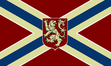
Virginia
Best: Winchester
Cool! This heraldically correct beauty looks like it could fly proudly anywhere in Europe. Indeed, that shield is the same one that adorn the flag of Winchester, England:
Hmm. I take that back. FOTW is usually pretty reliable when it comes to this sort of thing. Not sure what happened here - or where the white lion comes from.
The X, of course, comes from the Confederate battle flag. Given that, my guess is it will be redesigned any day now.
Winchester, VA, USA is located in the far northern part of the state, near the mouth of the Shenandoah River. It's got 27,000 people, a ton of history (esp. Civil War), is famous for apples, and counts polar explorer Richard Byrd and C&W singer Patsy Cline as famous sons (and daughters).
If I sound like I know a lot about the place, I do. I lived just over the Blue Ridge, less than 20-miles away.
Worst: Bridgewater
A seal on a bedsheet is bad enough, but when your seal looks like a particularly inept Boy Scout patch, you gotta seriously wonder if it might not be time to come up with something new.
Interestingly, I found a different, slightly better seal out there on the interwebs, so maybe we can just sub that in:
Sub in a different color (the blue of the state flag, say), and it’d look even better.
This town of 6,000 is also in the Shenandoah Valley, and also features an institution of higher learning, Bridgeport College.
Washington
Best: Bellevue
This one seems to have all the tropes of the Pacific Northwest baked right in. Blue and green colors? Check. Conifer? Check. Yin-yang swerve? Whoa! Now, that’s a little different. It really is super-effective though. I honestly can’t think of another municipal flag out there that does that.
Honorable mention: Seattle
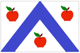
Worst: Wenatchee
Honestly, it’s not awful. It could definitely use a little help though, that’s for sure.
Let me attempt to explain a little of what’s going on here. This town of 33,000 in the north central part of the state is known as the “Apple Capital of the World,” so the apple theme makes a ton of sense. It also just so happens to be known as the “Buckle of the Power Belt of the Great Northwest [!?!?],” which makes a little less sense, but is what the left part of the apple is trying to show (those are dams).
You know, maybe that’s just trying to do too much. Or maybe that latter part isn’t terribly obvious (you could swap blue for yellow, but that would be one weird apple). And then there’s all that text (and not to mention that pretty dated font).
There are actually heraldic apples out there, so maybe something like this might work:
Feel free to make those 3 blue lines if that’s an important feature (I just couldn’t make it work in Microsoft Paint).
West Virginia
Best: Dunbar
Hard to believe that this is the best out there. It does get some credit for simplicity, if nothing else.
This town of 8,000 is just down the Kanawha from Charleston. It’s where the Gravely plow was invented (whatever that might happen to be).
Worst: Chapmanville
I’m assuming there’s more to this town than just the local high school’s football team.
Indeed, Wikipedia tells me this place dates all the way back to 1800 (though it was only incorporated in 1947). It has 1,200 inhabitants, and is in the southwest corner of the state. Notable residents include a couple of NFL and MLB players I’ve never heard of, as well as a real live WV governor.
Dishonorable mention: Huntington
Wisconsin
Best: Beloit
Great (and unusual) colors. I also like that thing in the middle (it’s a water wheel), as well as how easily it fits in with the rest of the flag. Somebody thought this one out!
Whence the water wheel though? Turns out one of the things that attracted settlers to this place in the first place was the water power. Here are a couple of interesting fun facts about the city:
- The name was fashioned after Detroit (and is, in fact, pronounced as if the two rhymed)
- Is where the speedometer was invented
- Is also the home of Korn Kurls, arguably the first snack
- Claims Danica Patrick as a famous daughter
Honorable mention: Madison
Worst: Kenosha
Wow! There’s a lot going on here. Unfortunately, here’s all we know about it:
The City of Kenosha, Wisconsin, replied to me with a photo of the flag and image of the logo. According to the Kenosha city clerk, the flag must be from 1950's or 1960's, but he couldn't find any document about it. (FOTW)
Everyone’s probably heard of Kenosha, but did you know they’re in the very most southeastern part of the state and have 100,000 people?
Dishonorable mention: Milwaukee
Wyoming
Best: Johnson County
Forget the seal, okay? Now, check out that crazy version of the Union Jack? Know where it comes from? Would you believe it’s the Basque flag?
Yup, Johnson County was the home of a number of Basque settlers. There were actually a surprising number of Basque immigrants in the Rockies (usually, as sheepherders), and Basque cuisine is still a feature in these states.
Worst: Byron
Wow, typewriter font and everything.
This tiny town of less than 600 was named after settler and Mormon leader Byron Sessions. Not a lot to say about this place, so maybe we could use the red stripes from the standard coat of arms:
… and combine it with the name “Byron” (but a little more attractive text). Like so:
Not sure what font to go with. Take your pick.
Washington, DC
And here is NAVA’s #1! It comes directly from George’s family coat of arms:
... and is probably the perfect expression of the benefits of using good heraldic design in coming up with a good city or county flag. Which is also my main advice to you mayors and city councilmen … and a fitting end to this blog.
More links:
South Dakota
Best: Hermosa
I love the large, rather different elements in this one. The seal is pretty lame, but I do like that sun. In a similar vein, the “South Dakota” doesn’t add a lot, but the Western-style font on “Hermosa” is very nice.
Seeing as this place has less than 400 people, I’m actually pretty impressed with this one. The town itself is in the southwest part of the state.
Worst: Rapid City
Now, on the other hand … I mean, that’s a pretty big city for such a lame snoozer of a flag.
The seal’s not bad, but throwing it against a white background sure does wash it out. How about something with a little more color contrast? The state flag features a pretty unique hue, so why not use that:
Still pretty washed out, though, isn’t it? Guess we really need to just up the color contrast on that seal. An entirely different approach, though, might be to hone in on that “star of the west” deal:
Feel free to put “Rapid City” or even “South Dakota” in there. Simple, curved, black text around the star might work fine. Just keep it simple, Rapid Citizens. Heck, you could even just leave it as is.
Tennessee
Best: Maryville
Whoa, clever! Not too surprisingly, this was the winner of a contest. Interestingly, the winner, one Ken Bright, was from the UK.
Maryville is a city of 27,000, just south of Knoxville. Well-known Maryvillians include Lamar Alexander and Sam Houston.
Honorable mention: Memphis
Worst: Collinwood
You know, sometimes, less is more.
But, just in case, you were wondering:
The Trojan head portrays Collinwood's schools. The mascot is centrally located to show that the school is the center of the Collinwood community. The items surrounding the Trojan head display the opportunities for a great education through studies and extra curricular activities offered at Collinwood Schools. Presented in the top left is the Old Depot Train Station. The Logging Industry is shown in the upper right corner. The church at the bottom right represents the many churches of the area. The bottom left picture symbolizes the City park. (FOTW)
Trojan head? I thought it was a Martian (or maybe a slug) with a fan behind it.
Sigh … Hard to know where begin. This place is so small, their flag is such a wreck, and you definitely want your town to be known for something other than just your high school football team.
Well, here’s a shot at just reducing the amount of stuff at least:
Yeah, I know it’s a little spartan (groan) …
Texas
Best: Dallas
Nice little riff on the Lone Star flag there.
That little white stripe that makes sure that the red and blue don’t bump against each other? That’s called a "fimbriation."
Honorable mention: San Antonio
Worst: Bastrop
It looks like something scribbled on a napkin. By an 8 year old.
That’s supposed to be a pine tree, by the way. Given that, here’s something using that idea, but with a little less busyness and a little more class:
I know you’ve heard of Dallas and Houston. Bastrop, on the other hand, is a town of 7,000, not too far from Austin. It’s actually a popular film locale, including for no less a cinematic gem than The Texas Chainsaw Massacre. See here for where that rather odd name comes from.
Dishonorable mention: Lubbock
Utah
Best: Provo
So simple, so clean, such vibrant colors. Why can’t more city flags look like this?
This baby dates back to only 2015 – and was officially introduced on Twitter. Its old flag was recognized by NAVA as one of the worst in the country:
So, in other words, anything would have been an improvement. Good job, though, Provo!
Worst: Roy
You know, when you’re city’s got such a lame name as Roy, you really might want to tone things down a little, right?
This poor little burg was named after a local school teacher's child, Roy C. Peebles, who had just passed away. I’m sure there’s a great story there, but I’m afraid that’s all I know. The city was previously known as Central City, Sandridge, Basin, and Lakeview, which all seem just fine. I have no idea what to do with their flag. Well, at least they didn’t name it Peebles.
This place actually has 37,000 people. It’s close to Ogden.
Vermont
Best: Montpelier
And here’s one that dates back to only 2017. It’s another contest winner, and was designed by Montpelier native and industrial designer Chet Larrow.
It replaced something pretty lame as well:
If you’re a geography buff like me, you probably already know that Montpelier is the capital of the Green Mountain state. At 7,500 people, it also happens to be the smallest state capital out there.
Worst: Burlington
I’m guessing the original design was in crayon.
Sure enough, Flags of the World says, “It was designed about 10 years ago by 8th graders.”
They’ve got a contest going to come up with something a little bit less middle school. Maybe I should submit something.
STOP THE PRESSES! THEY HAVE JUST ANNOUNCED A WINNER:
The story is so heart-warming (to an amateur vexilloligist at least), I had to share it in full:
Congratulations to Owen and Lucas Marchessault on the selection of their design, which beautifully conveys our city’s history, character, and natural environment, as the new City of Burlington flag,” said Mayor Miro Weinberger. “It is fitting that a design created by two Burlington students should be chosen to replace the City’s original student-designed flag. Thank you also to Burlington City Arts for leading a process that involved more than 100 entries and engaged over a thousand Burlingtonians in selecting a new flag. I will be honored to officially unveil the new flag at First Night, and look forward to seeing it fly over City Hall – and many other parts of the City – for years to come.”
Public online voting ended on Friday, November 17. Residents were asked to rate the design and artist statements of the seven finalists from zero to ten. 1,427 residents participated in the voting phase; Owen and Lucas' design received the highest score.
Owen and Lucas' design was one of 138 designs submitted for consideration. Molly Abair, Owen and Lucas’ mother, shared their creative process: "We watched the Ted talk together (very inspiring!) and then we drafted several ideas over the course of several days and finally agreed on a final design concept. It was truly a collaborative effort. The three of us worked together, each providing input on the colors, the number of peaks, the thickness of lines, etc.
The twin brothers are honor roll students at Edmund's Middle School and play soccer in their free time. "I was going to the City of Burlington website to obtain an update on the impending teacher's strike and happened upon the Burlington City Flag contest,” Molly said. “I showed the boys, and we decided that this would be the perfect project for them to work on during the strike while out of school."
The Marchessault family worked together to create a final design that includes a representation of:
- The sky, representing looking back to our rich history and ahead to the unknown future with perpetual hope
- Snow covered mountains - an indelible backdrop to our city
- The Green Mountain State, Burlington’s commitment to the environment, and education
- The breakwater, which protects Burlington’s spectacular waterfront, and
- Lake Champlain, which sustains and enriches our community and lives.

Burlington is actually Vermont’s most populous city, at 42,000.
More links: