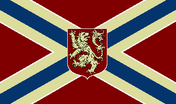
Best: Winchester

Hmm. I take that back. FOTW is usually pretty reliable when it comes to this sort of thing. Not sure what happened here - or where the white lion comes from.
The X, of course, comes from the Confederate battle flag. Given that, my guess is it will be redesigned any day now.
Winchester, VA, USA is located in the far northern part of the state, near the mouth of the Shenandoah River. It's got 27,000 people, a ton of history (esp. Civil War), is famous for apples, and counts polar explorer Richard Byrd and C&W singer Patsy Cline as famous sons (and daughters).
If I sound like I know a lot about the place, I do. I lived just over the Blue Ridge, less than 20-miles away.
Worst: Bridgewater

A seal on a bedsheet is bad enough, but when your seal looks like a particularly inept Boy Scout patch, you gotta seriously wonder if it might not be time to come up with something new.
Interestingly, I found a different, slightly better seal out there on the interwebs, so maybe we can just sub that in:

Sub in a different color (the blue of the state flag, say), and it’d look even better.
This town of 6,000 is also in the Shenandoah Valley, and also features an institution of higher learning, Bridgeport College.
Washington
Best: Bellevue

This one seems to have all the tropes of the Pacific Northwest baked right in. Blue and green colors? Check. Conifer? Check. Yin-yang swerve? Whoa! Now, that’s a little different. It really is super-effective though. I honestly can’t think of another municipal flag out there that does that.
Honorable mention: Seattle
Worst: Wenatchee

Honestly, it’s not awful. It could definitely use a little help though, that’s for sure.
Let me attempt to explain a little of what’s going on here. This town of 33,000 in the north central part of the state is known as the “Apple Capital of the World,” so the apple theme makes a ton of sense. It also just so happens to be known as the “Buckle of the Power Belt of the Great Northwest [!?!?],” which makes a little less sense, but is what the left part of the apple is trying to show (those are dams).
You know, maybe that’s just trying to do too much. Or maybe that latter part isn’t terribly obvious (you could swap blue for yellow, but that would be one weird apple). And then there’s all that text (and not to mention that pretty dated font).
There are actually heraldic apples out there, so maybe something like this might work:
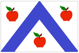
Feel free to make those 3 blue lines if that’s an important feature (I just couldn’t make it work in Microsoft Paint).
West Virginia
Best: Dunbar

Hard to believe that this is the best out there. It does get some credit for simplicity, if nothing else.
This town of 8,000 is just down the Kanawha from Charleston. It’s where the Gravely plow was invented (whatever that might happen to be).
Worst: Chapmanville

I’m assuming there’s more to this town than just the local high school’s football team.
Indeed, Wikipedia tells me this place dates all the way back to 1800 (though it was only incorporated in 1947). It has 1,200 inhabitants, and is in the southwest corner of the state. Notable residents include a couple of NFL and MLB players I’ve never heard of, as well as a real live WV governor.
Dishonorable mention: Huntington
Wisconsin
Best: Beloit

Great (and unusual) colors. I also like that thing in the middle (it’s a water wheel), as well as how easily it fits in with the rest of the flag. Somebody thought this one out!
Whence the water wheel though? Turns out one of the things that attracted settlers to this place in the first place was the water power. Here are a couple of interesting fun facts about the city:
- The name was fashioned after Detroit (and is, in fact, pronounced as if the two rhymed)
- Is where the speedometer was invented
- Is also the home of Korn Kurls, arguably the first snack
- Claims Danica Patrick as a famous daughter
Honorable mention: Madison
Worst: Kenosha

Wow! There’s a lot going on here. Unfortunately, here’s all we know about it:
The City of Kenosha, Wisconsin, replied to me with a photo of the flag and image of the logo. According to the Kenosha city clerk, the flag must be from 1950's or 1960's, but he couldn't find any document about it. (FOTW)
Everyone’s probably heard of Kenosha, but did you know they’re in the very most southeastern part of the state and have 100,000 people?
Dishonorable mention: Milwaukee
Wyoming
Best: Johnson County

Forget the seal, okay? Now, check out that crazy version of the Union Jack? Know where it comes from? Would you believe it’s the Basque flag?
Yup, Johnson County was the home of a number of Basque settlers. There were actually a surprising number of Basque immigrants in the Rockies (usually, as sheepherders), and Basque cuisine is still a feature in these states.
Worst: Byron

Wow, typewriter font and everything.
This tiny town of less than 600 was named after settler and Mormon leader Byron Sessions. Not a lot to say about this place, so maybe we could use the red stripes from the standard coat of arms:

… and combine it with the name “Byron” (but a little more attractive text). Like so:


Not sure what font to go with. Take your pick.
Washington, DC

And here is NAVA’s #1! It comes directly from George’s family coat of arms:

... and is probably the perfect expression of the benefits of using good heraldic design in coming up with a good city or county flag. Which is also my main advice to you mayors and city councilmen … and a fitting end to this blog.
More links:
No comments:
Post a Comment