Friday, July 27, 2018

US Municipal Flags – Hawaii thru Iowa

Hawaii

Best:  Honolulu


Seeing as there are only two municipal flags in the whole state, this one will have to do. 

Yeah, it is a little bright. But, you know, I kinda like it. A yellow background is just not something you see every day. 

As for that seal, well, at least it does include the coat of arms of the state (and, with one little change, the coat of arms of the former kingdom as well).


Worst: Maui


Wow. This train wreck might have been the state’s worst even if it had 100 of them. The colors, the text, the outlines of the islands, that weird pink thing … 

By the way, that weird pink thing is actually a silversword. They are found only in Hawaii and only at elevations over 5000’. Here’s what one really looks like: 


Perhaps something a little more stylized might work. Chaminade University’s sports teams are known as the Silverswords, and they use a logo that might provide some inspiration:


So, what I’m thinking is:

  • Keep the baby blue background
  • Ditch the sword
  • Make the blades silver (or at least white)
  • Add some more bits to the top and make them pink

I’m not going to try and attempt all that with MS Paint, so have at it Photoshoppers.


Idaho

Best:  Canyon County


Had to resort to counties for Idaho. Just not that many people there, I guess.

Once again, simple and elegant wins the race. A border might be a nice idea, but that pic on the seal is just so colorful that that’s probably not necessary.

Not familiar with Canyon County? It’s just west of Boise. That location probably accounts for it being the 2nd most populous county in the state, accounting for over 10% of all Idahoans.


Worst:  Kuna


The clip art school of flag design.  

This town of 15,000 is in the same rough area of Canyon County (oh, just a little bit south and east). The name may mean “end of trail or, alternatively, “green leaf – good to smoke.” Wait a minute – shouldn’t this town be in Colorado then?

How might we improve this monstrosity? Maybe we could take one or two of those elements, and go from there. They seem quite proud of their raptors, so why not a silhouette of one? “Kuna” could perhaps be added in script underneath. We could probably keep the light blue, but definitely ditch the gradient. Whether we go with black or white for the other elements would depend on how dark the blue is. Here, how about this one:


Sorry. That’s the best I can do with MS Paint.

Dishonorable mention:  Pocatello


Illinois

Best:  Chicago


One of the real classics. It also just so happens to be Roman Mars’ favorite as well. He makes a very good point that one way you can tell that a flag is a success is if you see it all over the place. I’ve been to Chicago. He’s right.

I love those stripes. The only other flags I can think of that have them are Israel, DC, and Mobile.

BTW, the North American Vexillological Association rated this one second of all cities across the country.


Worst:  Newark


This one was designed by Salvador Dali. While on acid. In the middle of a nervous breakdown.

Wow! Where did this come from? How about high school senior Hannah W.? I’m thinking with a little help from Photoshop or Powerpoint, and maybe some potent hallucinogens. 

A redesign? It’s hard to say. This burg of 900, just west of Chicago, doesn’t seem to be known for anything in particular. Maybe they can use the flag of Newark, NJ (for which they were named) as a model:


I like the blue border. If that clock means something, maybe they could include that, plus the name and date – though in a much more standard rendition. Good luck Newarkers!


Indiana

Best:  Clarksville


Wow! What a beaut. A classic example of good heraldic design.

Clarksville is right across the Ohio from Louisville. It was founded by George Rogers Clark, and dates all the way back to 1783.

Honorable mention:  Indianapolis


Worst:  Columbus


What a busy, color-wheel mess. We’ve got the full town name, a (very detailed) skyline, the letter C, a pretty crazy rainbow thing … 

Brian Bailey, a local artist is responsible for this mess. Maybe he should have gone with his last initial, like Hannah.

This town of 44,000 is about midway between Indianapolis and Louisville. It’s the home of Cummins Diesel and a surprising amount of classic modern architecture. I’m talking  Saarinen, Pei, Pelli, Venturi …

Maybe that could give us an idea for our flag. Here, for example, is Saarinen’s North Christian Church:


And here is a flag based on that:


See what I did there?


Iowa

Best:  Madrid


This looks a little like it might sit outside a fancy motel chain. That said, it sure is classy. Big fan.

Madrid? Why, it’s the capital of Spain, of course.

Oh, Madrid Iowa? Well, that one has 2,500 people, is almost in the dead center of the state, and is part of the larger Ames-Boone, Iowa Combined Statistical Area. And none of that could possibly explain how they came up with this killer flag. (Though this killer pedestrian bridge that I recently discovered just may.)


Worst:  Cedar Rapids


You know, that’s a pretty big city to come up with such a cheesy, amateurish nightmare. This baby was a major “star” in Roman Mars’ TED talk. And I heartily agree. I mean, where to even begin?

For one thing, in spite of this flag seeming to show just about everything, there is one thing missing, a local landmark called the Tree of Five Seasons:


How about if we just superimposed the logo for that thing on the Iowa state flag (which looks a little like the flag of France):


Done.


More links:

Sunday, July 22, 2018

US Municipal Flags - Colorado thru Georgia

Colorado

Best:  Denver


I tend to shy away from these, but this one is absolutely perfect. It’s a wonderful combination of the abstract and the literal. It’s also reflects the state flag as well. Margaret Overbeck, a high school student, designed this. Nice job, Margaret! The North American Vexillological Association ranked this one #3 overall.


Worst:  Commerce City


What the heck is it? Flags of the World wonders if it’s “possibly a stylized tree.”

Commerce City is a suburb of Denver. It’s known for a huge oil refinery, and is also the site of Denver’s soccer team.  

How might we improve this? Slightly more realistic tree? Maybe we could keep the color (it’s pretty unique) and definitely the border. 

Or, then again, maybe we could go in a completely different direction. Here, for example, is a design for the flag of the soccer team:


Vexilloligists – have at it!


Connecticut

Best:  Fairfield 


Interesting. Those are pretty unlikely colors, but they’re treated in a nice, simple, traditional manner. I like it.

This town of 60,000 is on Long Island Sound, and is basically a tony suburb of The Big Apple. It’s home to a university, GE’s headquarters, many commuters, and such leading lights as Leonard Bernstein, Robert Penn Warren, Jason Robards, Hume Cronyn, Paul Hogan, and Don Imus.


Worst:  Cornwall


Just to clear things up, what we’ve got here is a cow and a covered bridge. Why they are rendered on top of one another and in those particular colors is beyond me. Yup, it’s distinctive alright. 

Maybe we could try something reflecting the original Cornwall, in the UK? Its flag is a simple white on black cross. We could add a cow in the upper left to distinguish it (weird), or maybe the symbol of Cornwall from their coat of arms (less weird, but barely):


The town? It’s on the northwest part of the state, and has about 1,400 people. “Notable people” include Ethan Allen, James Thurber, Abe Ribicoff, and Sam Waterston. It's also home to Dudleytown (AKA "The Village of the Damned"), a deserted townsite in the spookily named Dark Entry Forest.


Delaware

Best:  Middletown


Yes, it’s boring. At the same time, it really is classy though. Simple, elegant. I like.

This town of 20,000 is in the north of the state. It’s basically a suburb of Wilmington, and is kind of lost in the sprawl of Philadelphia. There’s a pretty tony prep school there, St. Andrews.


Worst:  Milton


This one is actually not that bad. It just looks too much like the sign for a seafood restaurant. 

Perhaps we could simply eliminate some of that text – the DELAWARE & “founded 1763” (or at least the founded). Milton might come below then: 


Milton’s main claim to fame is being the home of Dogfish Brewery.


Florida

Best:  Coral Gables


It’s a tad like the flag of India. But, honestly, who would know that other than a vexilolligist? It's also way too close to the flag of Miami as well:


Perhaps we could throw in a little wrinkle to make it stand out:


The colors are associated with the University of Miami, which is indeed located in CG. It’s another lovely little town (which the author has visited on business).

Honorable mention: Tallahassee


Worst:  Sarasota


And here I thought David was in Florence, Italy. Turns out this David “represents the City's strong tie to the cultural arts within the community.” 

It’s a great town. Spent many Thanksgivings there on the beach. 

How to fix it up? Boy, where to begin?

Well, here is a flag for something called “Age-Friendly Sarasota”:


Hmm … Just might work. You guys wanna swap?


Georgia

Best:  Savannah


It’s another SOB, but the border, the stars, the simple seal really make this very classy and distinctive.

Been here as well. In fact, it’s one of my favorite towns. And it’s just like Forrest Gump and Midnight in the Garden of Good and Evil make out.


Worst:  Chickamauga


One basic vexillilogical principle is to not have your flag made up of other flags. Throw in lots and lots of text, a super-boring seal, and we’ve got a really nice train wreck here. Wondering what this is all about? 

Chickamauga was actually the site of a major Civil War battle. The town is just south of Chattanooga, and the Union victory here basically opened up Atlanta to invasion. The national battlefield here also happens to be one of the best in the country. Yup, I’ve been there too. 

Improvements? How about something as simple as the silhouette of a cannon? There’s also a pretty famous tower on the battlefield. Either of those would work pretty well. 


Here’s an example using the cannon, and including a basic blue/grey theme:


More links:

Friday, July 6, 2018

US Municipal Flags – Alabama thru California


Alabama

Best:  Mobile


I really like this one. Very distinctive. It’s the basic pattern of the Israeli flag, something that’s not used that much. Also, the seal’s not too bad. Luckily, it’s too small to show the rather boring details. I guess, more than anything, I really just like the 3rd color it introduces.

Honorable Mention:  Birmingham


Worst:  Trussville


Poor Trussville. You’re boring, you’ve got way too much text, and your colors are bland.

Oh, the actual town? It’s a suburb of Birmingham. Money Magazine actually has it pegged as one of the nation’s 100 Best Places to Live.

The gateway is nice and seems to be important to the town. Perhaps it could’ve simply been blown up and the text ditched:


Alaska

Best:  Seward


This one's pretty much brand new, dating back to only 2016. The symbolism's pretty obvious - mountains, snow, blue sky - but also very well done. And I love the reflection of the state flag in the star in the upper right corner. The designer was Katelyn Correa, a local schoolgirl who won a contest with over 350 submissions.


Katelyn, with mayor Jean Bardarson

Seward is one of the better-known Alaskan cities. It’s named after the man who bought Alaska from Russia. In fact, Alaska was once called Seward’s Folly.

Honorable mention:  Anchorage


Worst:  Wasilla


This isn’t a flag. It’s a painting! This should be hanging over a fireplace somewhere, not flying over city hall.

Did Sarah Palin design this one? Yup, that’s where she’s from.

Perhaps we could just simplify this one a little.  I mean, mountains, sunset, moose, lake, field … I like them all, but maybe not all at the same time.

Dishonorable mention:  Juneau


Arizona

Best:  Scottsdale


Another good example of a decent “SOB.” It’s a little boring, but is actually pretty classy as well. And you gotta love that cowboy. It reminds me of the Wyoming license plate.

Oddly, they're coming up with a contest to replace it. The 10 finalists, though. don't look like any kind of improvement. To me, most of them don't look like flags. No sense of history either.

Scottsdale is a cool little town, right outside of Phoenix. I’ve heard it called the Arizona version of Miami Beach. Went to a conference there once.

Honorable mention:  Phoenix


Worst:  Winslow


Whoa! Color contrast! Color contrast! Also, what the heck is that thing?

Now, I do like that baby blue, so maybe we could keep that. As for the seal, perhaps we could introduce something that references Winslow’s long transportation history – Route 66, the railroads ... I know! How about the shield from the Route 66 sign, with the city name at top, and an alternate version of that figure (it’s supposed to be an Indian mask, by the way):


Boy, I don’t know. I’m just not sure about that mask thing. Maybe we could just ditch it altogether and go all full Route 66:


Arkansas

Best:  Ft. Smith


Not a big fan of the seal. The rest of the flag, though, is awesome. In fact, I’m surprised there isn’t a country out there who hasn’t adopted this basic pattern.

Ft. Smith is the 2nd largest city in Arkansas. It’s in the northwest, right on the border with Texas.


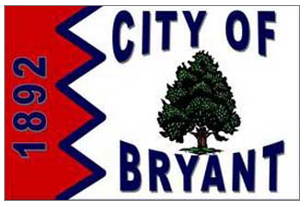
Worst: Bryant


I like the tree and the little jaggy thing (which reminds me of the flags of Qatar and Bahrain). 

Once again, if we just eliminate all that text, we might just be okay:


By the way, Bryant is a suburb of Little Rock.


California

Best:  Los Angeles


You may have heard of this place before. Indeed, the larger cities tend to have better designs, almost at the country level. The seal, on the other hand, is pretty forgettable. It’s also small enough, though, that it doesn’t really matter.

This baby dates back to the 1930s. Not sure where the colors come from, but I’m guessing the green & red are from Mexico. The serrated edges are pretty unique.


Worst:  Riverbank


Wow! It’s almost all text. In fact, it looks like a button, something you might pin on your blazer.

Indeed. Riverbank’s Deputy City Clerk comes clean: “In 2002, a company in Las Vegas, NV specializing in label pins, designed our current City flag” (Flags of the World).

Perhaps they could have ditched the text & kept the colors and wave form. The seal’s not gonna help us here any, I’m afraid:


As you can possibly tell from that seal, the town is known for its wine and cheese festival. It’s got about 20,000 people, is a little east of Los Angeles, and is about half Latino.


More links: