Best: Denver

I tend to shy away from these, but this one is absolutely perfect. It’s a wonderful combination of the abstract and the literal. It’s also reflects the state flag as well. Margaret Overbeck, a high school student, designed this. Nice job, Margaret! The North American Vexillological Association ranked this one #3 overall.
Worst: Commerce City

What the heck is it? Flags of the World wonders if it’s “possibly a stylized tree.”
Commerce City is a suburb of Denver. It’s known for a huge oil refinery, and is also the site of Denver’s soccer team.
How might we improve this? Slightly more realistic tree? Maybe we could keep the color (it’s pretty unique) and definitely the border.
Or, then again, maybe we could go in a completely different direction. Here, for example, is a design for the flag of the soccer team:

Vexilloligists – have at it!
Connecticut
Best: Fairfield

Interesting. Those are pretty unlikely colors, but they’re treated in a nice, simple, traditional manner. I like it.
This town of 60,000 is on Long Island Sound, and is basically a tony suburb of The Big Apple. It’s home to a university, GE’s headquarters, many commuters, and such leading lights as Leonard Bernstein, Robert Penn Warren, Jason Robards, Hume Cronyn, Paul Hogan, and Don Imus.
Worst: Cornwall

Just to clear things up, what we’ve got here is a cow and a covered bridge. Why they are rendered on top of one another and in those particular colors is beyond me. Yup, it’s distinctive alright.
Maybe we could try something reflecting the original Cornwall, in the UK? Its flag is a simple white on black cross. We could add a cow in the upper left to distinguish it (weird), or maybe the symbol of Cornwall from their coat of arms (less weird, but barely):

The town? It’s on the northwest part of the state, and has about 1,400 people. “Notable people” include Ethan Allen, James Thurber, Abe Ribicoff, and Sam Waterston. It's also home to Dudleytown (AKA "The Village of the Damned"), a deserted townsite in the spookily named Dark Entry Forest.
Delaware
Best: Middletown

Yes, it’s boring. At the same time, it really is classy though. Simple, elegant. I like.
This town of 20,000 is in the north of the state. It’s basically a suburb of Wilmington, and is kind of lost in the sprawl of Philadelphia. There’s a pretty tony prep school there, St. Andrews.
Worst: Milton

This one is actually not that bad. It just looks too much like the sign for a seafood restaurant.
Perhaps we could simply eliminate some of that text – the DELAWARE & “founded 1763” (or at least the founded). Milton might come below then:

Milton’s main claim to fame is being the home of Dogfish Brewery.
Florida
Best: Coral Gables

It’s a tad like the flag of India. But, honestly, who would know that other than a vexilolligist? It's also way too close to the flag of Miami as well:

Perhaps we could throw in a little wrinkle to make it stand out:

The colors are associated with the University of Miami, which is indeed located in CG. It’s another lovely little town (which the author has visited on business).
Honorable mention: Tallahassee
Worst: Sarasota

And here I thought David was in Florence, Italy. Turns out this David “represents the City's strong tie to the cultural arts within the community.”
It’s a great town. Spent many Thanksgivings there on the beach.
How to fix it up? Boy, where to begin?
Well, here is a flag for something called “Age-Friendly Sarasota”:

Hmm … Just might work. You guys wanna swap?
Georgia
Best: Savannah

It’s another SOB, but the border, the stars, the simple seal really make this very classy and distinctive.
Been here as well. In fact, it’s one of my favorite towns. And it’s just like Forrest Gump and Midnight in the Garden of Good and Evil make out.
Worst: Chickamauga
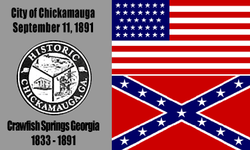
One basic vexillilogical principle is to not have your flag made up of other flags. Throw in lots and lots of text, a super-boring seal, and we’ve got a really nice train wreck here. Wondering what this is all about?
Chickamauga was actually the site of a major Civil War battle. The town is just south of Chattanooga, and the Union victory here basically opened up Atlanta to invasion. The national battlefield here also happens to be one of the best in the country. Yup, I’ve been there too.
Improvements? How about something as simple as the silhouette of a cannon? There’s also a pretty famous tower on the battlefield. Either of those would work pretty well.

Here’s an example using the cannon, and including a basic blue/grey theme:

- < US city flags - Alabama thru California
- > US city flags - Hawaii thru Iowa
- International
- Countries
- US states
- Site intro
No comments:
Post a Comment